

Services / Design
Design people trust at first sight
People judge your business in the first five seconds. Great design isn't decoration, it's what makes visitors trust you, understand you, and choose you over the tab next door.
The whole job, owned
We can carry this end to end
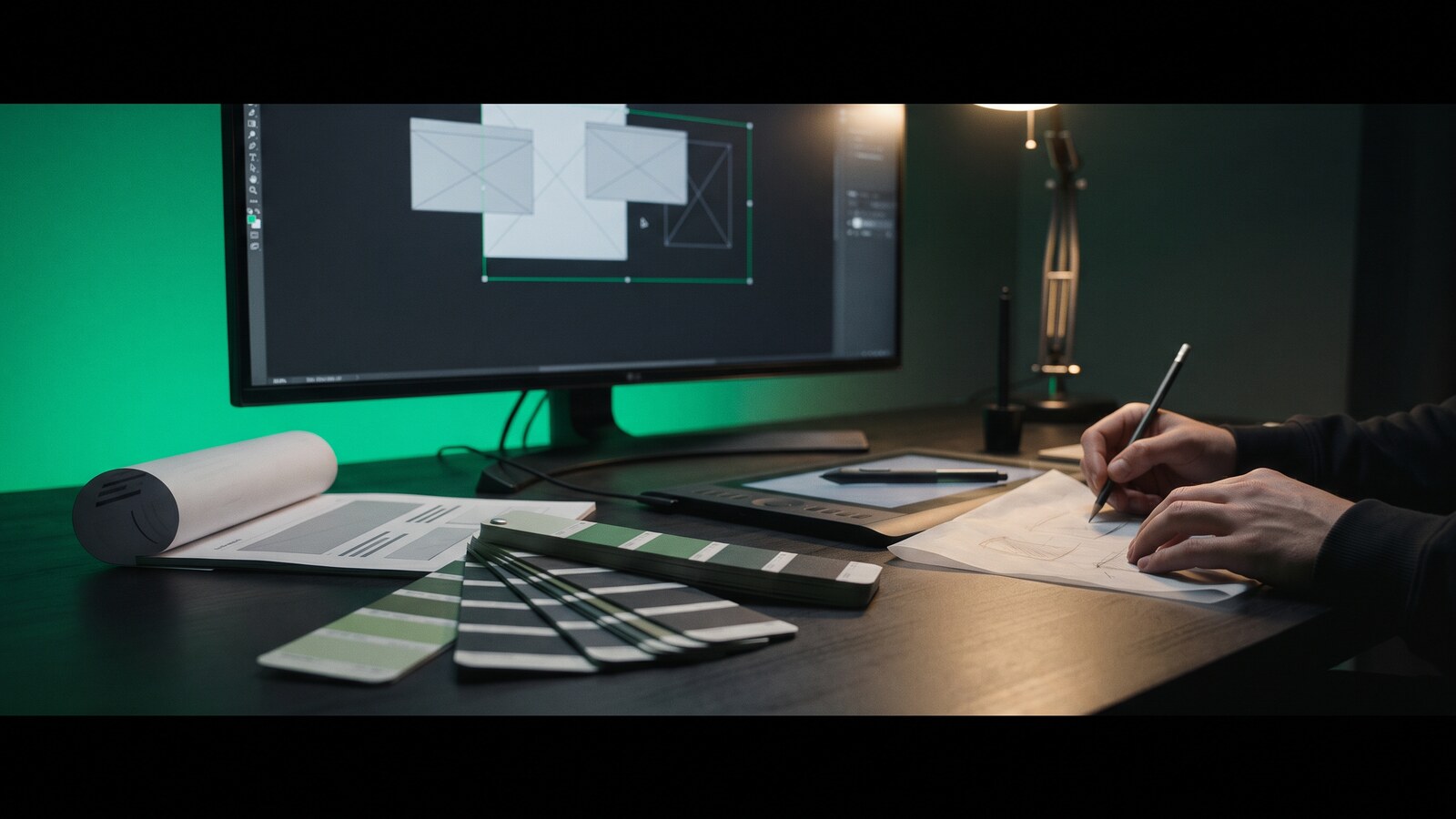
Design here isn't a mood board, it's a delivery discipline. We interview your customers, map their journeys, sketch and prototype, test with real users, and hand over an organised design system, so what ships is exactly what was approved, and every future feature inherits the same quality.
The craft runs deep: everything is checked for accessibility, works beautifully in light and dark mode, moves smoothly without slowing anything down, and is delivered as a documented kit your developers, or ours, can build from for years. Brand work covers logo, colour, typography, and voice. Everything a growing company shows the world.
What we build
Made for your business
Product design (UI/UX)
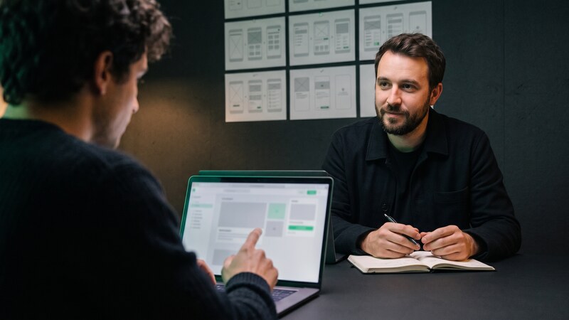
Interfaces so clear they don't need a manual: researched, prototyped, and tested with real users.
Explore this service →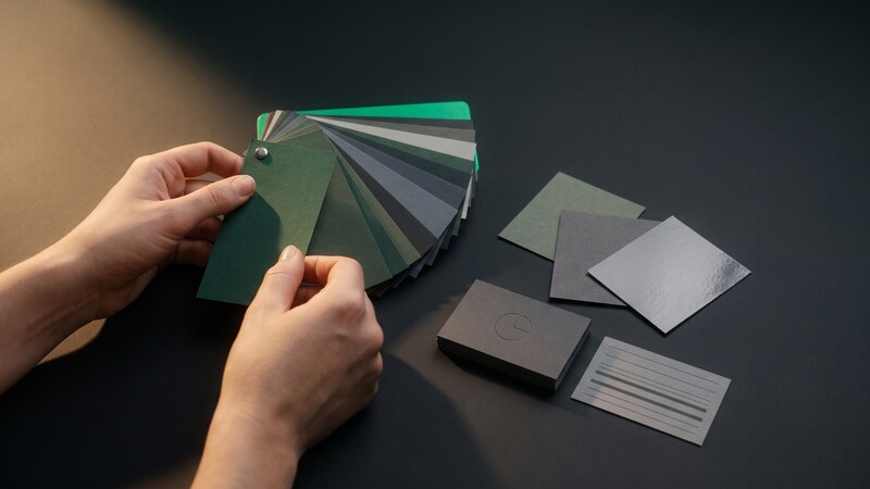
Brand identity
Logo, colors, typography, and voice that look like the company you're becoming, consistent everywhere you show up.
Explore this service →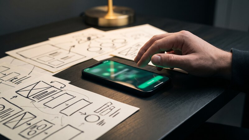
Prototypes before code
A clickable version of your product in days, not months, so you can test the idea before paying to build it.
Explore this service →
Design refresh
An existing product made modern, accessible, and easier to use, often without changing a line of backend code.
Explore this service →The full range
If you can describe it, we can build it
From a single landing page to a complete brand, this is the range of design work we deliver, always as organised, reusable files you own.
01
Product design
- ✓ Website design
- ✓ Web-app & dashboard design
- ✓ Mobile-app design
- ✓ Clickable prototypes
- ✓ Design systems & component kits
- ✓ UX audits & redesigns
- ✓ Accessibility audits
- ✓ Onboarding & checkout flows
- ✓ Email & notification design
02
Brand & identity
- ✓ Logos & full identity systems
- ✓ Rebrands & refreshes
- ✓ Brand guidelines
- ✓ Naming & tone of voice
- ✓ Custom icon sets
- ✓ Illustration & 3D
- ✓ Photography direction
03
Marketing & sales
- ✓ Landing-page design
- ✓ Pitch decks & investor materials
- ✓ Social-media templates
- ✓ Email & newsletter templates
- ✓ Display-ad kits
- ✓ Presentation templates
- ✓ Print essentials (cards, brochures, signage)
- ✓ Trade-show & event materials
Don't see yours? The list only ends because the page has to. Describe what you need, in your own words is fine.
How delivery works
One contract, zero handoffs
The same disciplined lifecycle behind every engagement, so you always know where the project stands.
Discovery & scoping
Workshops with your stakeholders, a technical audit of what exists, and a written scope with a clear estimate and timeline. You approve before anything is built.
Architecture & design
System design, security and compliance review, data modeling, and clickable prototypes. The expensive mistakes get caught here, on paper, where they're cheap.
Build in weekly sprints
Working software demoed every week, code-reviewed and covered by automated tests in CI/CD. You watch it grow instead of waiting for a big reveal.
Hardening & QA
End-to-end testing, load testing, penetration checks, and user acceptance with your team, signed off against the scope, line by line.
Launch
Zero-downtime deployment, monitoring and alerting switched on, your team trained, and documentation handed over. You own the code and the infrastructure.
Run & improve
Written SLAs, automated monitoring with alerts, security patching, and a monthly improvement allowance. The product keeps getting better after launch day.
The technology
2026 tools, plainly explained
Design in 2026 is a discipline with systems and standards. We bring the same rigor to how things look as engineers bring to how they run.
A design system is a kit of reusable parts. It keeps every screen consistent and makes future features faster and cheaper.
One source of truth in Figma
Organised, professional design files, not a folder of loose screens. Developers read exact sizes, colours, and behaviours straight from the file, which removes an entire category of 'that's not what the design showed' disputes.
Design and code that can't drift apart
Colours, sizes, and spacing are defined once and used directly by both the designs and the code. A theme change or a rebrand propagates everywhere from one edit, instead of being reapplied screen by screen.
A parts kit for every future screen
Every component is delivered with all its states (hover, loading, error, empty) plus guidance on when not to use it, in a live reference developers build against. It's what makes your second and third product cheaper than the first.
Motion that explains, not decorates
Animations are specified precisely, built so they never cost smoothness, and switched off for people who prefer reduced motion. Movement is used to show what changed on screen, never for its own sake.
Icons and illustration that are yours alone
A custom icon set drawn on one consistent grid, plus illustration or lightweight 3D where it earns its place. Owning distinctive visual assets is a large part of what stops your site looking like every other template.
A brand kit anyone can apply
Logo variants, a colour system with contrast already verified, type hierarchy, photography direction, and tone of voice, delivered as working files plus a usage guide, so a new hire or an outside agency gets it right without asking us.
We design from evidence, not opinions, watching real users try things beats guessing every time.
We ask before we draw
Structured conversations with the people who'll use the product and the people who own the outcome, distilled into findings. It routinely reveals that the requested feature wasn't the real problem, which is the cheapest possible moment to find that out.
The whole journey, mapped
The end-to-end path a customer takes, including the phone calls, emails, and internal handoffs around the software. Mapping it exposes where the real friction sits, which is often in a process rather than on a screen.
Watch five real users: learn everything
We sit representative people in front of the product with real tasks and record what happens, clipped so your team can watch the exact moment someone gets stuck. Five participants reliably surface most usability problems: unusually good value.
Click it before you build it
An interactive version your team and customers can actually try, typically within days. Changing a prototype costs minutes; changing built software costs weeks, so this is where we deliberately front-load the arguments and changes of mind.
Test ideas fairly (A/B testing)
When two versions compete, we run the comparison honestly: enough visitors, a fair reading of the result, and a record of what lost, since knowing which ideas fail prevents them being proposed again next year.
Design that keeps improving after launch
Visitor journeys, heatmaps, and drop-off points reviewed regularly against the goals we agreed. Design becomes an ongoing loop tied to measurable outcomes, not a project that ended at launch.
Accessible design reaches the 1 in 6 people with a disability, and it's increasingly required by law in major markets.
Works for the 1 in 6 others exclude
Full keyboard use, screen-reader support, readable contrast, and clearly labelled forms, tested with the real assistive tools people use, because automated checks catch perhaps a third of actual issues. It meets the WCAG standard the law increasingly points to.
An accessibility report you can publish
For an existing product: an issue-by-issue audit ranked by user impact and effort, a phased fix plan, and a conformance statement you can publish. This is exactly what a procurement questionnaire or an EU accessibility obligation asks you to produce.
Dark mode nearly for free
Light and dark themes derived from the same definitions, with contrast checked in both, respecting each visitor's preference. Designed in from the start, a second theme costs almost nothing; retrofitted later, it's a substantial rebuild.
Beautiful from phone to boardroom screen
Layouts designed for the screens your visitors actually use (small phones to ultrawide monitors, with touch targets sized for fingers) and verified on physical devices, not just a resized browser window.
Beauty that doesn't cost speed
The cost of a hero video, a heavy font, or a rich animation is weighed during design, not after a speed report disappoints someone. It avoids the familiar cycle of building something beautiful and then stripping it back.
Ready for other languages and markets
Layouts that survive long German words and right-to-left Arabic, with local formats for dates and prices, and no text baked into images. Built in from the start, this costs a fraction of retrofitting it when you open a new market.
Does your product look as good as it is?
Send us a screenshot or a link. We'll share three honest, specific improvements: free, no strings.
Explore more