Services / Design / Brand identity

Look like the company you're becoming, everywhere you show up

A brand is not a logo. It is what someone remembers after the tab is closed (the colour, the typeface, the tone of the email) and it only works if it is the same in every place your business appears.

Why it matters

The cost is the wait

Most companies do not choose a brand, they accumulate one. A logo drawn quickly in the first month, a colour someone picked inside a slide deck, three typefaces because three different people made three different documents, and a tone of voice that changes depending on who wrote the email. It holds together until the day you are being compared, side by side, with someone who looks like they have their act together.

Identity work is a decision-making exercise before it is a drawing exercise. What is this business for, who is it for, how should it feel next to the alternatives, and what will still be true in five years when the product range has changed. The marks come out of those answers, which is why an identity bought off a marketplace so rarely survives contact with the second product line or the first serious customer.

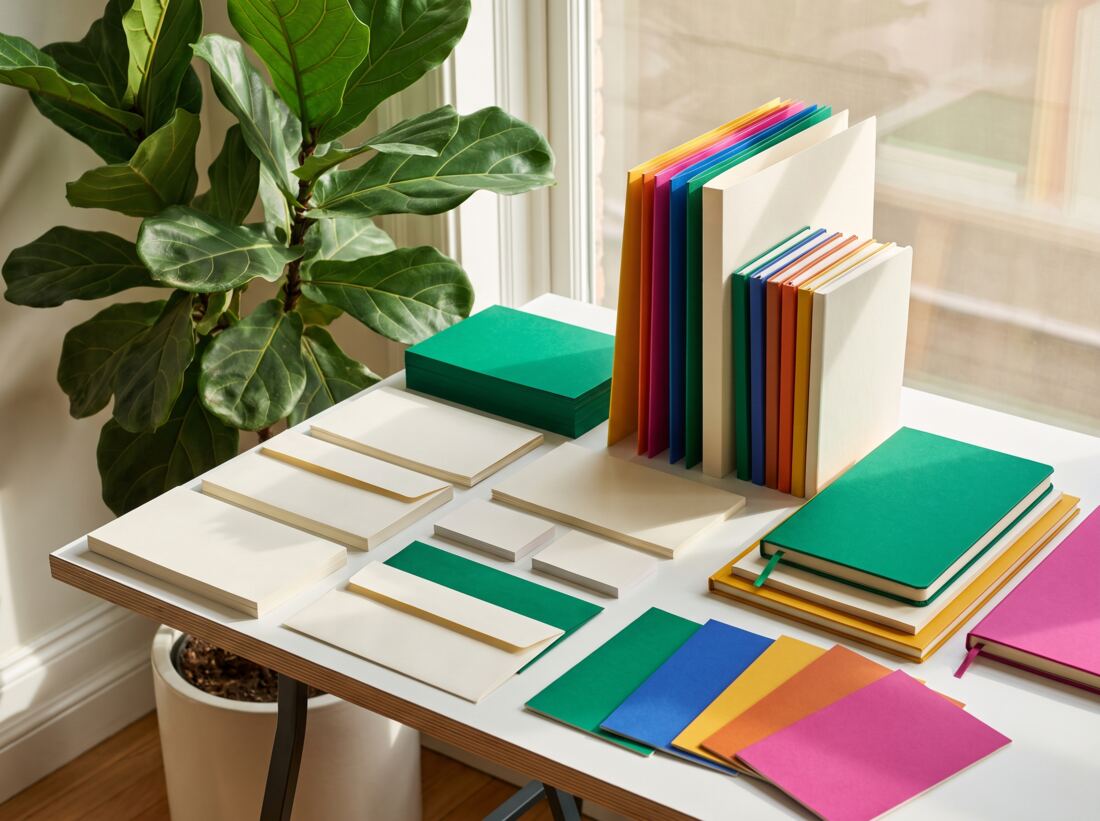
We deliver the working parts: a primary mark with the variants you genuinely need (small, single-colour, square avatar, reversed on dark), a colour system with contrast already verified, a type hierarchy, an icon set drawn on one grid, photography and illustration direction, tone of voice with worked examples, and a guide that lets a new hire or an outside agency get it right without asking us. Source files included, in formats you can open.

What you actually get

Built to be trusted

A brand is only as good as its worst application: the invoice, the job advert, the trade-show banner. This is what we make sure exists.

01

A mark that survives being small

Logos die at sixteen pixels and in single-colour print. We design the primary mark alongside the variants it will actually need (stacked, horizontal, icon-only, reversed, one-colour) and test them at the sizes they will really be used at.

02

A colour system, not a palette

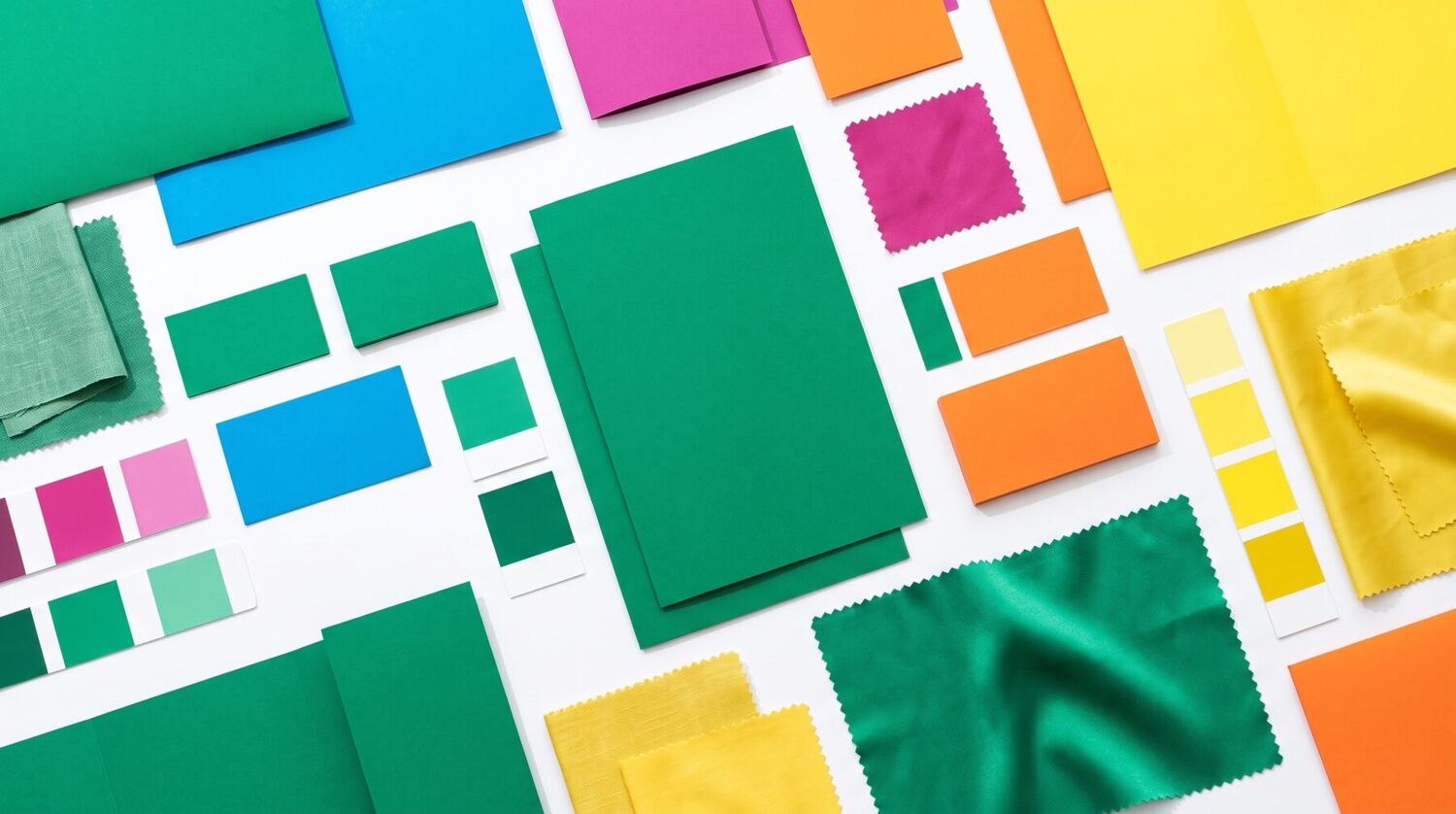
Primary, secondary, neutrals and the semantic colours for success, warning and error, defined once with the contrast pairs already checked, so nobody has to guess whether white text is legible on your brand blue. It maps straight onto light and dark themes in the product.

03

Type you are allowed to use

A hierarchy from headline to caption with sizes, weights and line lengths specified, chosen with licensing and page weight in mind. A typeface you cannot licence for your website, or one that costs half a second of load time, is not a decision we will make quietly on your behalf.

04

Icons and illustration that are yours

A custom icon set drawn on one consistent grid, plus an illustration or lightweight 3D direction where it earns its place. Owning distinctive visual assets is most of what stops a business looking like every other template.

05

Words, not only pictures

Tone of voice defined by example (how you write a headline, a confirmation email, an apology, a rejection) plus the words you use for your own product and the ones you have decided never to use again.

06

A guide people will actually follow

Working files plus a usage guide that answers the awkward cases: minimum clear space, what to do over a photograph, and the wrong ways people will inevitably try. Kept somewhere your team can find it, not as a PDF in one person's downloads folder.

Where it earns its keep

Same pattern, different desks

Identity work comes from a handful of honest triggers, and it is worth knowing which one you have.

Professional services

01 · Professional services

Looking like the firm you have become

The problem
The identity was made when the business was three people and a spare room. The work is now enterprise-sized, and the proposals sit alongside competitors who look considerably more expensive, which costs you on price before anyone has read a word.
What we build
A positioning workshop, then an identity built for the room the work is now pitched in: a restrained mark, a serious type hierarchy, proposal and pitch-deck templates, and document formats the team can use without a designer standing over them.
What changes
Materials that match the size of the work being sold, and a team that can produce them at the pace deadlines actually arrive.
Consumer & retail brands

02 · Consumer & retail brands

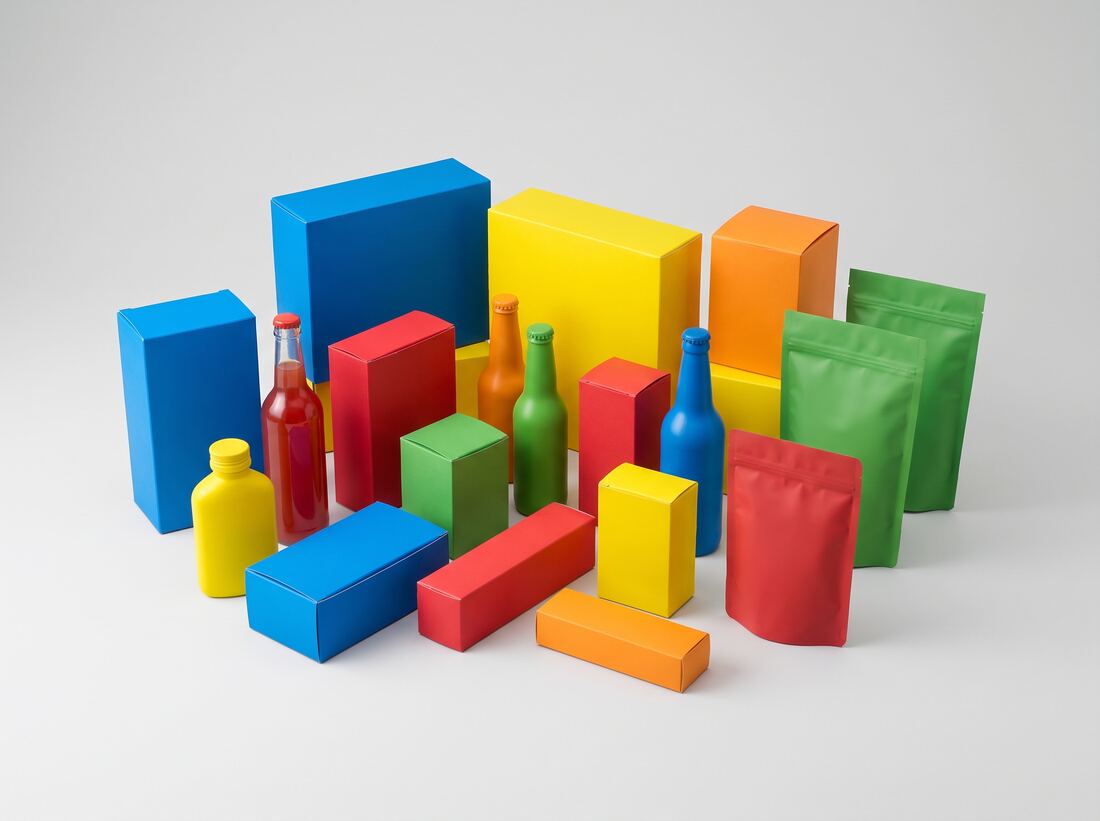
One brand across a shelf, a screen and a shopfront

The problem
Website, packaging, delivery notes and social accounts were all made by different people at different times. Customers meet three versions of the same company and none of them reinforce each other, so nothing accumulates.
What we build
One system applied across every surface, print and packaging specifications alongside digital tokens, photography direction, social templates the marketing team edits themselves, and a colour set that behaves predictably on screen and in ink.
What changes
A brand recognisable at a glance wherever a customer meets it, and a marketing team that ships campaign material without queuing for a designer.
Startups & funded scale-ups

03 · Startups & funded scale-ups

A face to put in front of investors and first hires

The problem
You have a product, a raise to run and a hiring plan, and the current identity is a marketplace logo plus a template deck. Investors, candidates and early customers are all judging credibility on very thin evidence.
What we build
A tightly scoped identity sprint: naming support where it is needed, a mark, a colour and type system, a pitch-deck template and a website direction. Built for where you are now, with the structure to extend later rather than the full programme you cannot yet justify.
What changes
A company that reads as fundable and hireable, without spending runway on a brand exercise sized for a business three years ahead.

The technology

The tools behind it, named

Brand work is mostly craft and judgement, but the files you receive decide whether the brand survives its first year. These are the tools behind the delivery.

6 layers · 25 technologies

01

Drawing the marks

Vector work built properly: correct curves, real outlines, and files that stay crisp from a favicon to a building sign.

  • Figma
  • Adobe Illustrator
  • Adobe Creative Cloud
  • Affinity Designer

02

Type & colour

Chosen for the way you will actually use them: licensing you can afford, weights that render well on screen, and colours that survive being printed.

  • Google Fonts
  • Adobe Fonts
  • Fontshare
  • Pantone
  • Variable fonts

03

Icons, illustration & 3D

The distinctive assets nobody else has. Drawn on one grid, exported clean, and light enough to put on a web page.

  • Iconify
  • Blender
  • Figma
  • Procreate

04

The brand in motion

Logo animation, transitions and social motion. Specified so they can be rebuilt in code rather than shipped as a heavy video.

  • Rive
  • Lottie
  • Adobe After Effects

05

Guidelines & templates

Where the rules live so people follow them. Editable templates beat a beautiful PDF that nobody opens twice.

  • Notion
  • Figma
  • Zeroheight
  • Frontify
  • Mailchimp

06

Asset pipeline & delivery

Every mark exported in the formats each team needs, optimised so the logo on your website weighs kilobytes rather than megabytes.

  • SVGO
  • Squoosh
  • Cloudflare
  • Webflow

Product names and logos are the property of their respective owners and are shown to describe the technologies we work with. Their use does not imply any partnership, sponsorship or endorsement.

How we deliver it

Live behind a human first

Four to ten weeks depending on scope, a focused identity sprint at one end, a full programme with naming, print and guidelines at the other.

01

We work out what the brand has to do

A workshop with the people who can actually decide: what the business is for, who it competes with, what you want a stranger to think in five seconds, and the constraints, the sectors you sell into, the regulations, the equity in the current brand you cannot afford to throw away.

02

We look at the landscape honestly

A survey of how your competitors and the adjacent categories present themselves. The point is not to copy whoever looks best; it is to find the visual territory that is unoccupied and defensible for you specifically.

03

We agree a direction before polishing one

Two or three genuinely distinct territories, each shown with a mark, a colour idea and typography in real contexts rather than floating on white. You pick a direction here. We do not develop three in parallel, because that is how budgets disappear.

04

We draw it properly

The chosen direction developed into the full system: mark and variants, colour with verified contrast pairs, type hierarchy, icon grid, and the first real applications: website header, invoice, deck, packaging or signage as relevant to you.

05

We test it where it will live

The identity applied to the awkward cases: a tiny favicon, a single-colour print, a busy photograph, a dark background, somebody else's marketplace listing. Whatever breaks here gets fixed before the guide is written.

06

We hand over the kit and the rules

Source and export files in the formats each team needs, tokens for the developers, editable templates for marketing, and a usage guide covering the mistakes people would otherwise make. Plus a session so everyone knows where it all lives.

Before you commit

The questions worth asking

Will a rebrand fix our sales problem?

Usually not by itself, and it is worth being blunt about that. If people are not buying because the product does not solve their problem, because the price is wrong, or because nobody has heard of you, a new logo does not change the arithmetic, and it consumes money and attention that would have done more elsewhere. A rebrand pays when how you look actively contradicts what you are selling: when you have grown past your identity, when you look smaller or older than you are, or when inconsistency is stopping any recognition from building. If we think that is not your situation, we will say so.

Everyone here has an opinion on the logo. How do you handle that?

By making the criteria explicit before anyone sees a mark. In the first workshop we write down what the identity has to achieve and who it has to appeal to, and we judge the options against that rather than against personal preference. We also show work in context (on a phone, on an invoice, on a sign) because a mark floating in the middle of a white slide invites a decorating conversation. And we need one named decision-maker. Consensus on a logo is achievable, but the way you get it is usually by removing everything distinctive.

Will we lose the recognition we have already built?

That is a real risk and it deserves a deliberate answer rather than an assumption. Evolution keeps the equity (the recognisable shape, the colour people associate with you) and modernises the execution, which is the lower-risk option when customers already know you. Revolution starts again, which is right when the current brand is actively working against you or the business has genuinely changed. We will lay out the trade-off with your specific equity in front of us, and there is no universally correct answer.

Do you handle naming and trademarks?

We help with naming: generating candidates, testing them for pronunciation and meaning, checking domains and obvious clashes. We are not a law firm. A proper trademark search and registration in your markets is a solicitor's job, and we will tell you to commission one before anybody falls in love with a name. Skipping that step is how companies end up rebranding twice.

What exactly do we receive?

Logo files in vector and raster formats with every variant, a colour specification for screen and print with contrast pairs, licensed or licence-clear typefaces with the hierarchy documented, the icon set as individual optimised files, any illustration or 3D assets, templates for the documents you produce most, developer-ready tokens, and the written guide. Editable source files as well as exports. You own the lot.

How long until the old brand is gone?

Longer than anyone expects, and planning for that is part of the job. There is always a tail: an old sign, a supplier's system, a PDF someone keeps emailing, a third-party listing you do not control. We give you a phased rollout list ordered by visibility, so the things customers see most change on day one and the long tail is worked through rather than forgotten.

Does your brand look like the company you are now?

Send us your logo, your website and one recent proposal or piece of packaging. We will tell you honestly whether you need a rebrand, a refresh, or just some rules: free, no strings.

Start the conversation

Explore more

The rest of Product & Brand Design